Nomad, based in Porto Portugal, could be described as a travel agency but in a non-conventional way. It’s not about sunny beaches or fancy resorts, it’s about trekking in Patagonia, climbing the Picos de Europa, experiencing India’s ancient ways and culture, journey through Madagascar or crossing the Greenland's icebergs.
It’s the experience and adventure of knowing our planet and its effect in ourselves.
In addition to the travelling experiences, Nomad cultivates a sense of community and enriches it with exhibitions, talks, events, and planet conscious awareness ideals.
The whole Nomad Experience is sum up in the tagline “Nomad — Novo ponto de vista/ Nomad — A new point of view”. A literal new point of view by travelling to an unknown place and a metaphorical traveller‘s new point of view to reframe actions and ideals about the planet, society and the way of being.
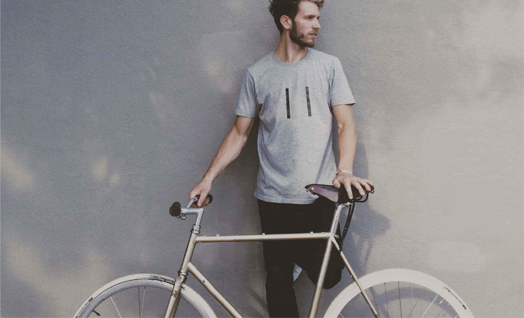
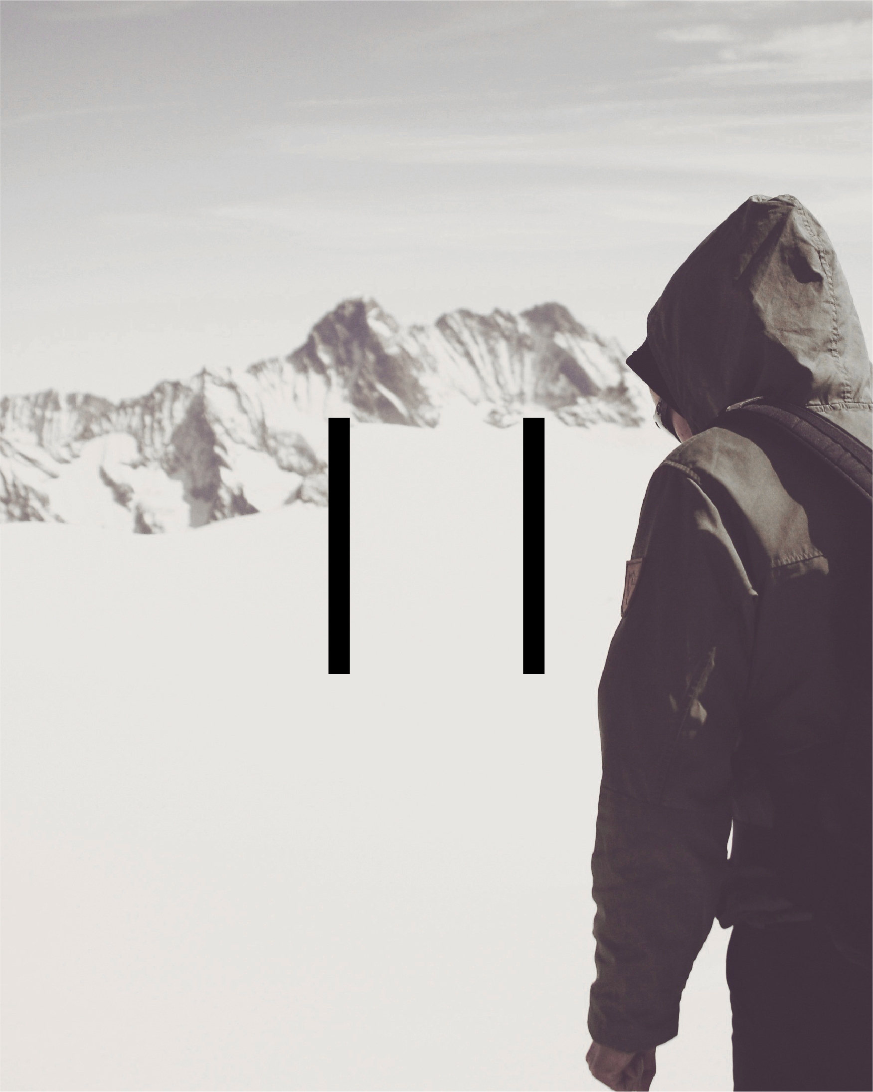
The new Logotype is materialized in the pause sign, in the idea of interruption of our daily routine, and between those bars takes place a Nomad experience.
A lexicon of icons was created to better express each trip and to create a universal Nomad language.
A new website, the centre of Nomad communication strategy, contact and selling point to all its clients/users, was designed in accordance with the identity system creating an immersive experience structured by functionality.


Project developed at united by.
Creative direction: Miguel Palmeiro
Branding & Icon design: Emídio Cardeira
UX/UI Design: André Covas
Creative direction: Miguel Palmeiro
Branding & Icon design: Emídio Cardeira
UX/UI Design: André Covas